
When it comes to marketing cosmetics, looks matter. And we’re not talking about the positive effects these products have on your appearance. The way you design your own cosmetic packaging can make a big impact on your sales numbers. The difference between products that fly off the shelves and those that languish on them often comes down to the way they appear to prospective consumers.
Best Cosmetic Label Designs from Our Customers
In this post, we take inspiration from our customers — ten cosmetics brands that are acing their label design. We highlight what makes each cosmetic label design so effective, providing you with cosmetic label design ideas you can use as you plan out the label designs for your own brand.
1. Duke Cannon Supply Co.
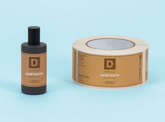
Harkening back to a simpler time, Duke Cannon Supply Co. specializes in men’s body care, cologne, and facial care products. Scent names like gun smoke, bay rum, and fresh-cut pine set the mood for some rugged branding. The product packaging doesn’t disappoint, either. Vintage-inspired artwork and old-timey fonts fit this brand’s vibe to a tee. Duke Cannon doesn’t shy away from bold colors or experimenting with metallic, strong design choices which help their products stand out heads above others in their category.
2. Barrister and Mann
Barrister and Mann are purveyors of fine grooming products for men. This company offers a full line of shaving, beard care, and bath and body products geared towards modern men with a penchant for the old-fashioned. By far our favorite Barrister and Mann product labels are those they use for their aftershave line. Each one features an ornate line drawing of an animal. No logo, no product description. Just a beautiful art piece printed on each bottle. This label design breaks all of the rules in a good way.
3. O’Douds
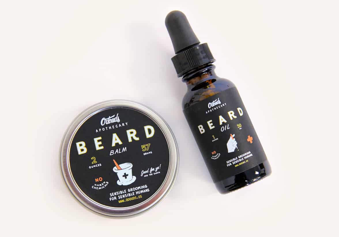
A hair and beard care company with a mission, O’Douds is an environmentally sustainable company committed to providing quality products crafted from natural ingredients. Each one of their products is certified cruelty-free and vegan. Their sophisticated Black Vellum labels effectively tie the different product lines together. Each one is instantly recognizable as an O’Douds offering, even though the product containers vary quite a bit. Each label sports the dapper O’Douds logo at the top, adding another layer of branding consistency.
4. Skin by Brownlee
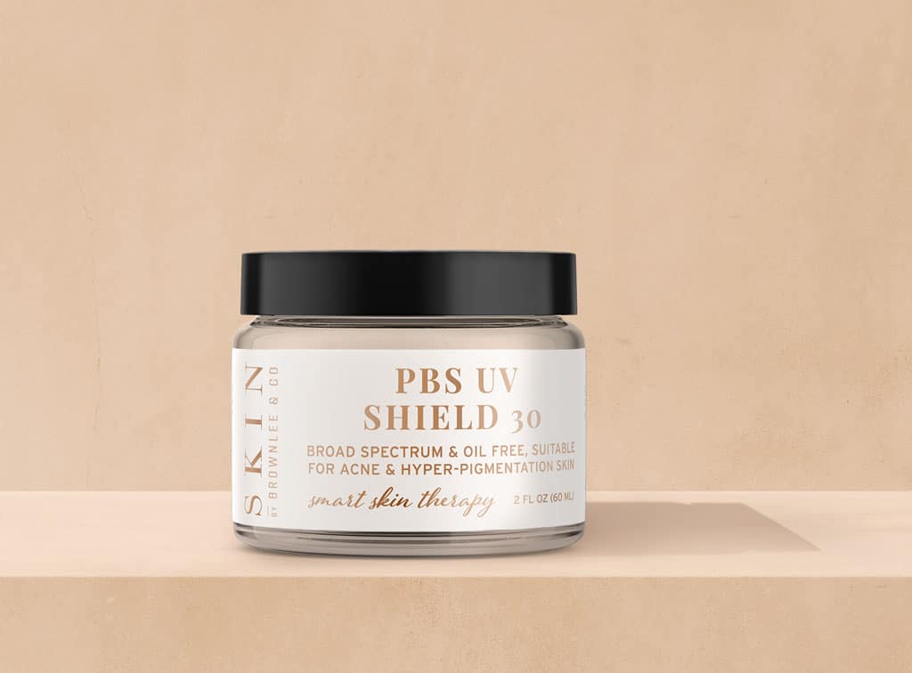
Skin by Brownlee specializes in acne and hyperpigmentation treatments. Since 2015, founder Sylvia Brownlee has been on a mission to restore the confidence of each of her clients. Their full line of facial scrubs, serums, and moisturizers are customized to fit the unique needs of each customer. The strength of their labels is in their simplicity. Each one follows a similar formula with an easy-to-read product name, followed by a simple description of what it’s designed to do. To add elegance, Skin by Brownlee utilizes a metallic substrate to bring out the vibrant bronze used for all text elements. Color and font remain the same across all their branding, making each of their products instantly recognizable as a Skin by Brownlee offering.
5. Sunday Riley
A focus on sustainability and a commitment to creating cruelty-free products are what sets Sunday Riley apart. Their cosmetic label designs are richly toned to exude a sense of high-end luxury. A touch of gold on each label communicates luxury without being heavy-handed. Although each bottle features a lot of text, the font sizes are perfectly balanced, giving these labels an uncluttered, esthetically pleasing look.
6. Maya Chia
This science-based skincare company doesn’t just rely on marketing mantras to get consumers to buy their products; they have science-backed research to prove it. As the name suggests, the not-so-secret ingredient in many Maya Chia products is chia seed oil. Their patented extraction process ensures maximum potency for healthier, more vibrant skin. What we love about their labels is the prominent place they’ve given their gorgeous golden sunburst logo. It sits atop each product label and serves as the unifying theme across their product lines.
7. elizabethW
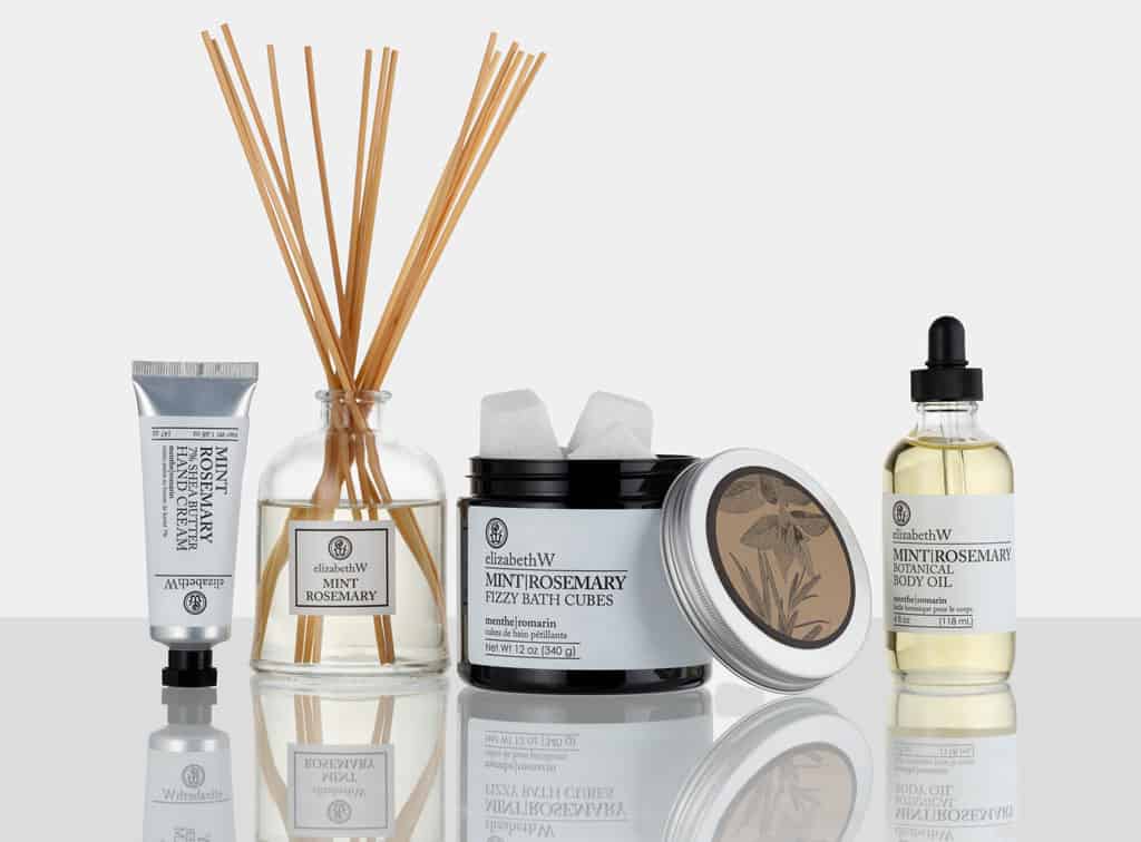
Named in honor of the founder’s great-grandmother, elizabethW pays homage to the power of nature-inspired scents. Featuring a full bath and body line, and scents for body and home, this West Coast retailer’s product labels reflect a commitment to keeping things simple. While each label only includes text elements, strategically shifting the font size, white space, and color choices give each one a fresh, modern look. The background color of the label corresponds with the product’s scent, adding a sense of unity to the design.
8. Etta + Billie
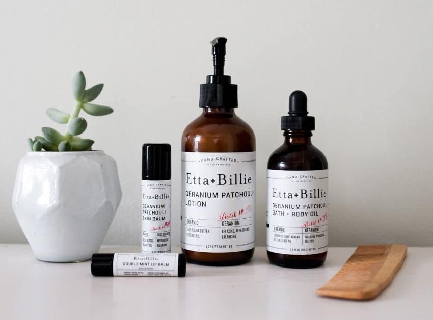
This body care company takes a cue from the founder’s love of good food and drink. Etta + Billie’s unique spin on body care products means blurring the lines between self-care rituals and a good snack break. (Cold brew mint coffee soap, anyone?) What we love the most about these labels are the scent notes printed on each one. That clues consumers into the olfactory experience they can expect when they use each product.
9. Whispering Willow Soaps
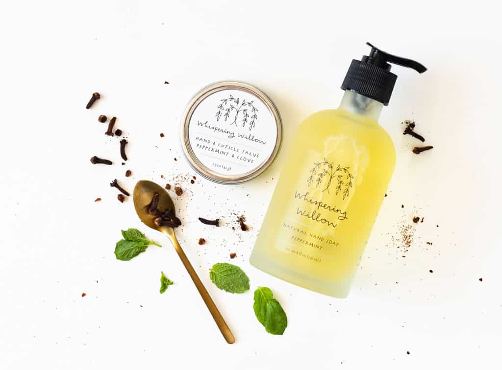
Whispering Willow Soaps is on a mission to empower its customers to reach out and help others by instilling a sense of wellbeing and promoting a commitment to self-care. After all, you can’t give of yourself to others until you’re full. In keeping with this calling, all of Whispering Willow’s product labels are calmingly simple. The minimalist logo tops each one, followed by a short, simple product title. The power of this brand’s labels is in the strategic use of white space. They’re clean and free of clutter. Sometimes less is more, and Whispering Willow Soaps is here to prove it.
10. PureLuxe Apothecary
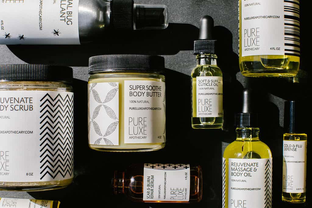
This company takes cosmetics label design to the next level. PureLuxe Apothecary crafts facial and body products using natural, whole ingredients that are free from synthetic materials, parabens, additives, and other components not found in nature. Additionally, their cosmetic label designs are beautiful to look at. The elegantly simple black-and-white design features easy-to-read text and black silhouette sketches of the botanicals used in each product. Although each product label is unique, they all follow a similar design template, making it easy to recognize each offering as part of the PureLuxe Apothecary brand.
Appearance Matters With Cosmetic Label Design
Designing labels for your cosmetics line is an important step you don’t want to gloss over quickly. The way a product looks to consumers is largely determined by the label you apply to your product packaging. A good label doesn’t just contain important information about your products; it’s a major part of your marketing effort, too. When it comes time to design your own cosmetic packaging, take some inspiration from the pros.
We’ve worked with cosmetic brands of all sizes, helping them to create packaging labels that stand out. Our team is happy to answer any questions you have about cosmetic labeling and help you choose the best type of label for your cosmetic products.
You might also like:
- How to Correctly Label Cosmetics
- The Ultimate Guide to Skin Care Packaging
- 7 Top Private Label Cosmetic Companies


