
In 2019, 77% of US consumers reported using at least one dietary supplement, representing a significant opportunity for new entrepreneurs seeking to enter the market. But it also presents a challenge since it requires standing out from a large number of competing brands vying for consumers’ attention. In this post, we’ll take a look at some excellent examples of supplement label design to uncover what makes their packaging work so well.
The best supplement labels have two things in common. 1) Top-performing labels feature graphics that are carefully tailored to appeal to the intended audience. 2) Those graphics are paired with a label material that complements and enhances the overall look of the product. Getting these two elements right will make the difference between a top-selling product and one that languishes on the shelves. To inspire you, here are ten of our favorite supplement and vitamin label designs.
1. Azoth
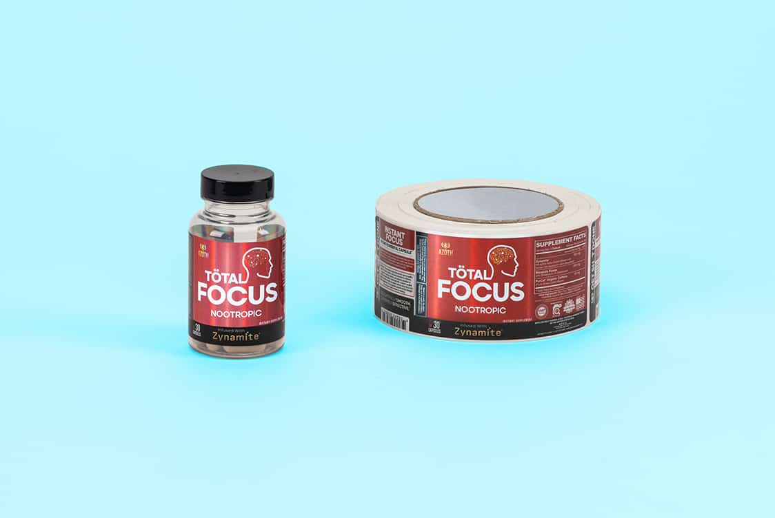
Azoth’s dedication to producing the highest quality nootropic supplements is apparent in their clean and professional packaging. All of their product labels are sharp and bright, utilizing holographic label materials to elevate their designs, reflecting what they promise their product will deliver. Azoth also showcases commitment to transparency by packaging their nootropics in clear supplement bottles, confidently allowing their product to speak for itself. Brands that pride themselves on providing a high-quality product could take inspiration from Azoth’s sophisticated packaging.
2. Highline Wellness
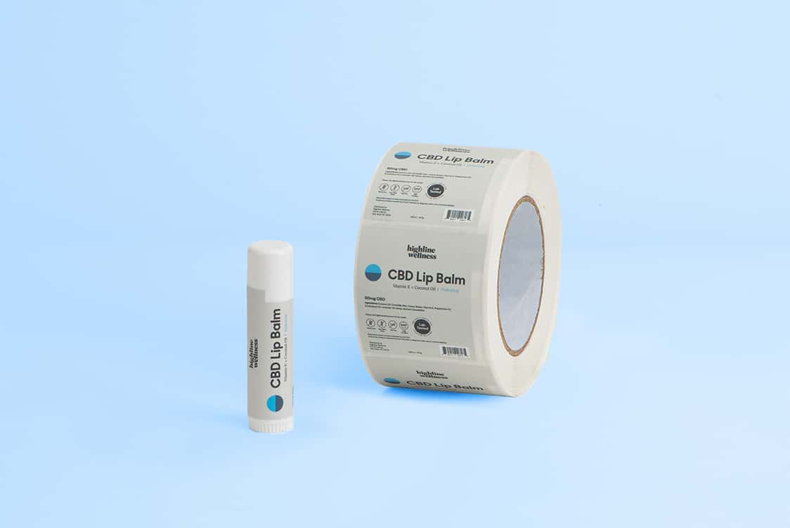
Highline Wellness masterfully employs color theory to tell their product’s story, both through the label and the product itself. Calming blue hues permeate their packaging and products, signifying the tranquility promised by their sleep remedies, while vibrant red energizing gummies are paired with matching labels to convey vitality. Highline Wellness’s elegant and understated packaging communicates total confidence in the product they have to offer.
3. OmniBiotics
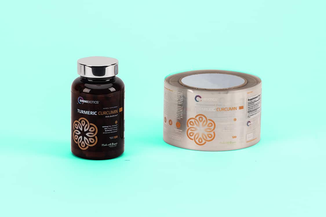
OmniBiotics is committed to providing safe and natural supplements to customers all over the world. Ultra-clear plastic labels communicate OmniBiotics’s intention to use clean ingredients, free of extra things like additives and chemicals; the straightforward, minimalistic front panel showcases everything customers want and need to know. If your brand is meant to appeal to an audience seeking natural, holistic solutions to their health needs, OmniBiotics packaging could certainly inspire.
4. Wellness Labs RX
This maker of hemp-based tinctures, capsules, gummies, and topicals blends bold labels with tinted glass bottles. And the labels for their line of hemp extract oils are the real standout. The supplement label features a clean font and a simple appearance. Strong colors on the vinyl label coordinate with the matching dropper top. Set against a backdrop of dark brown glass, this label design commands attention, while the uncluttered layout easily conveys key product details to the consumer.
5. Lucy’s Red Hot Delicious CBD Oil
This chili oil-laced CBD oil brand is an excellent example of using color to convey meaning. As you might expect, Lucy’s labels all use a vibrant, dark red set against a black background. The color matches the red found in most chilis and invokes the spicy heat you can expect out of these chili-infused CBD oils. The bottles are tinted, too, allowing the red to pop out with maximum effect.
6. Now Foods
This well-known manufacturer of dietary supplements showcases the power of simplicity. Now Foods uses the same basic design template for all of their products, from barley juice capsules to royal jelly supplements. Their signature orange background and plain, bold white font make their labels both easy to read and instantly recognizable as part of the Now Foods brand. White plastic labels, what Now Foods utilizes, are a great go-to material for supplement labels because of their durability and versatility in design
7. Iron Brothers Supplements
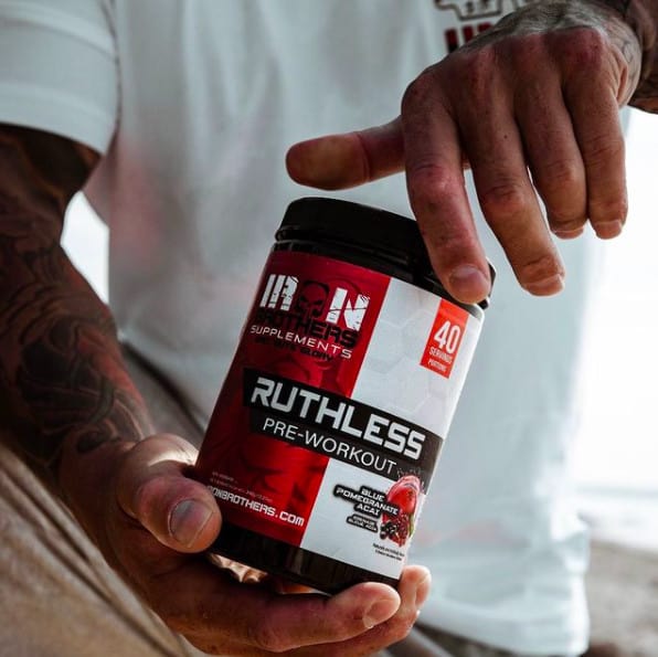
Creating consistent labeling across your product line makes it easier for consumers to associate a new or unfamiliar product with your brand. Iron Brothers Supplements uses chunky, aggressive-looking graphics for each container of stacks and supplements they sell. The images in the designs vary from product to product, but the style, font, and colors used to create a consistent theme that ties all of the products together. In case any doubts remain, their skull-themed logo graces the center of each supplement label.
8. Charlotte’s Web
Hailing from the glorious mountains of Colorado, Charlotte’s Web has artfully woven the mountain theme into all of their product labels. This CBD maker’s strategic use of mountain imagery shows how simple graphics can be effectively used to reinforce a brand’s heritage. From oils to gummies, their labels feature soothing mountain ranges that layer on top of one another to give a subtle nod to the wholesome, high country locale of this brand. Vinyl is the ideal label material to use on containers with small radiuses like tinctures to avoid flagging. Vinyl is also oil-resistant which is a big plus for products like CBD oil.
9. Human Project Company
This dietary supplement brand has mastered the use of strategic white space. The best supplement label designs aren’t always the busiest or most colorful; never underestimate the power of leaving some parts of a design empty. Each label in the Human Project Company lineup has large amounts of blank space surrounding the titles. The absence of color makes the simple font more readable and gives the label a cleaner, less congested feel. On the parts of that label that color has been used, the use of a plastic metallic label material has allowed for layering so only certain shapes and logos stand out in the metallic.
10. Ultimate Pet Nutrition
Nutritional supplements aren’t just for humans. Ultimate Pet Nutrition’s canine product line is dedicated to ensuring that man’s best friend stays at peak performance. And this dietary supplement company proves that a picture is truly worth more than a thousand words. The dominant image on each product label is a different, real-life picture of a happy, carefree-looking canine. A peppy Collie graces the front of the Nutra Thrive 40-in-1 Dog Food Booster bottle, while an adorable German Shepard with his head cocked to one side smiles from the Canine Detox label. Dog people love dogs. This smart use of real dogs on the product labels makes these products easy to pick up and put in a shopping cart.
Elevate Your Supplement Label Design
Creating high-quality supplement labels isn’t rocket science. But it doesn’t happen by accident, either. Your choice of colors, fonts, and label materials all need to mesh in such a way that they will have maximum impact on the people most likely to buy your product. The best supplement label design isn’t always the brightest, flashiest one. Instead, it’s the one that brings together solid design principles and the label material best-suited for the job.
You might also like:


